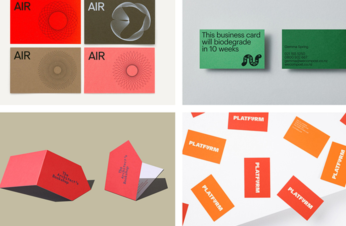
7 Tips On How To Design Unique Business Card

When it comes time to design your own business cards, it’s important to take into consideration what the final product will look like. There are several design elements that play a part in the design of your business card.
Keep reading for tips on how to design unique business cards.
1) Choose a Good Paper Stock
There are many different types of paper you can use for your business card. It’s important to pick a paper that lets your message shine through. If you want to highlight specific information, consider using glossy or brightly-colored stock for this information, and use the matte stock for the rest of the details. Of course, there is always an option of printing on both sides of the paper.

2) Use Quality Printing Techniques
Your card printer is an important part of the design process since they will be responsible for actually creating your business cards. There are many different print techniques and special effects that can make your business cards stand out from the crowd. If you want to learn more about printing techniques, talk to your printer about which options they offer.
3) Use One (or Two) Typefaces
When designing letters and numbers, it’s best to use one or two typefaces for business cards. Try not to use more than two different fonts in your design; the idea is to create a simple yet elegant look, not to overwhelm your potential clients. Choosing the right typefaces is key; consult a typography expert if you’re not sure which typefaces will work well together.
4) Stick to a Limited Colour Palette
When it comes to colors, it’s best to stick to a limited palette. This will help keep your business card looking professional and polished. Some businesses opt for a single color scheme, while others use two or three colors. Keep in mind that when it comes to colors, less is more.
5) Use Graphics and Images Judiciously
Graphics and images can be a great way to add visual interest to your business card, but you don’t want to overdo it. Too many graphics can make your business card look cluttered and busy, which is not what you want. Use graphics and images sparingly, and choose them carefully to ensure that they support your overall message.
With these seven tips in mind, you’re well on your way to designing unique and eye-catching business cards. Keep in mind that the most important thing is to create a card that reflects your brand and your message.
