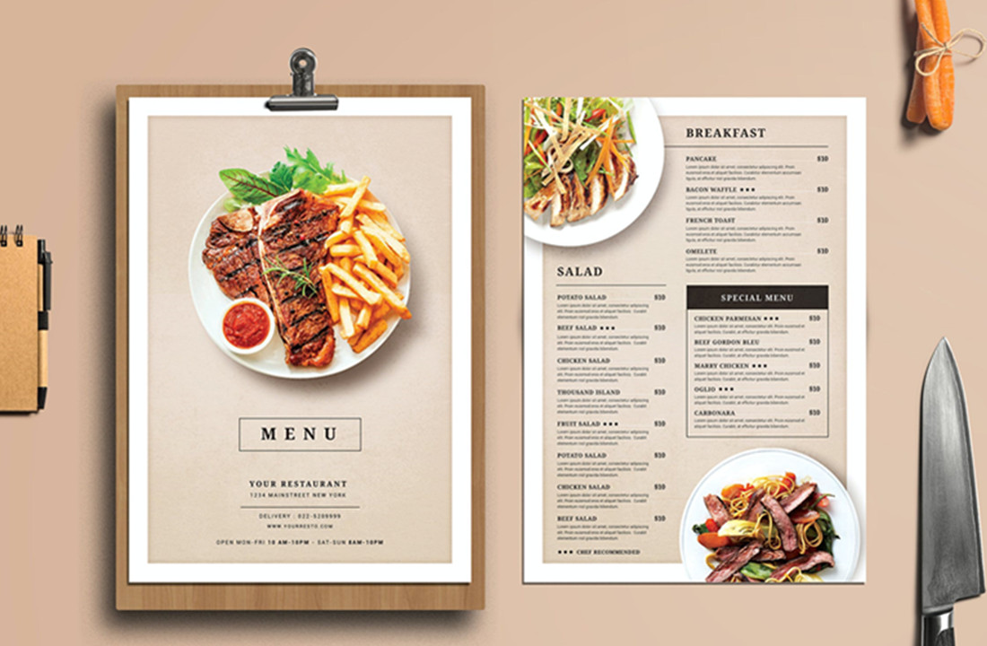
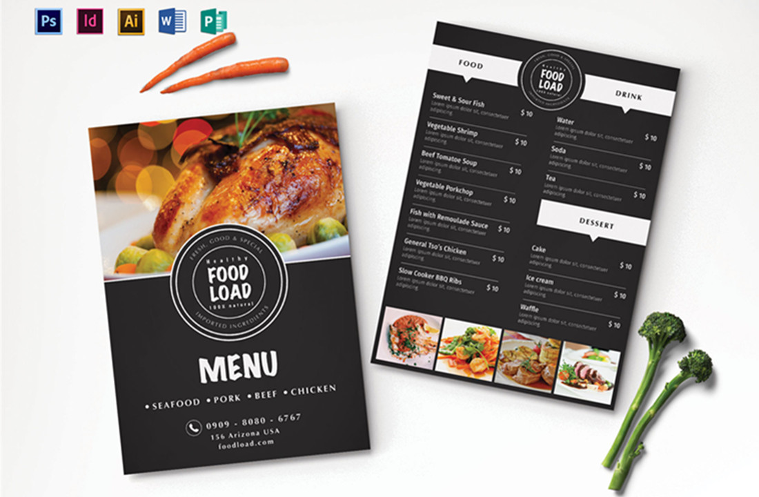
7 Menu Design Tips & Ideas For Business Newbie

1. Make the menu easy to navigate
A user-friendly interface is what will get more users to click through your site or app’s contents, so it would be helpful to simplify the navigation of the website. If you’re struggling with menu design, simplify the layout, grouping like items together and separating them with clear headings.
2. Use descriptive titles
When creating your titles, be descriptive and use terms that will accurately reflect the dish. Don’t just title a dish “pasta,” give specifics such as “penne alla vodka.” This will help reduce any confusion your guests may have about the dish.

3. Avoid clutter
Too many visuals or words on a page can be overwhelming and distracting for users. When it comes to menu design, simplicity is key. Stick to using a few fonts and images, and avoid overcrowding the pages.
4. Stick to a grid system
Grids are used in all kinds of menu design, yet it won’t be detracted by adding more elements to the page. By using a grid system, you can allocate space evenly and make sure there’s enough room for your visuals without overcrowding the pages.
5. Use contrasting colors
Having elements on the page with different color schemes will help them stand out against each other. This is especially important for dishes that have a lot of text, as it will be easier for users to read.
6. Use typography to your advantage
The typeface can play a big role in menu design. Different types of fonts can be used to set the tone and style of your restaurant. Sans-serif fonts are usually used for menus as they’re easy to read on digital screens.
7. Use images sparingly
While images are a great way to add visual interest, using too many can slow down the page loading time. Try to use high-quality images that are relevant to the dish and avoid using generic stock photos.
Menu design is an important part of any restaurant. By following these tips, you can create a menu that is easy to navigate and visually appealing.
