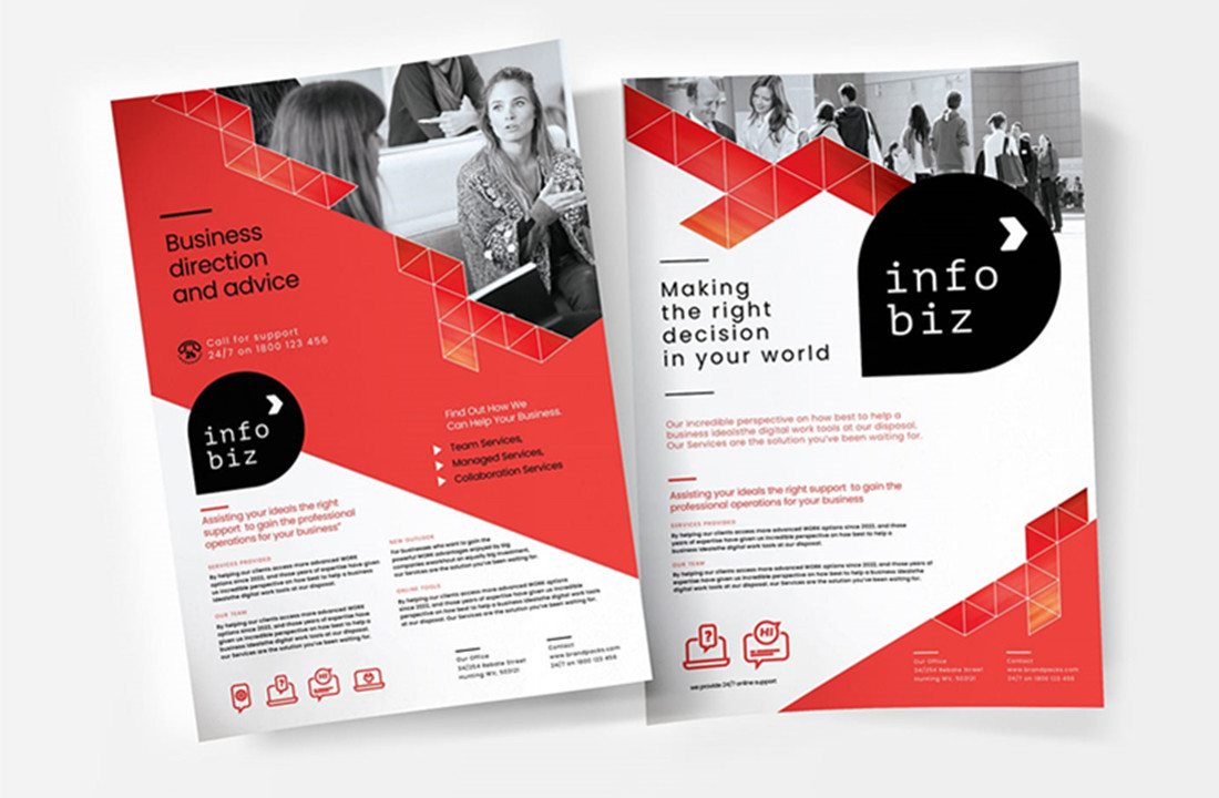
7 Poster Ideas That Will Help Your Business Grow

When creating a poster for your small business, Here are 7 tips to help you get started:
1. Keep it simple.
Your poster should be easy to read and understand. Stick to a simple design and use clear, concise text. Complicated designs or too much text can be overwhelming and may not be effective in getting your message across.
2. Use a strong headline.
Your headline is the most important part of your poster. It’s what will catch people’s attention and it should summarise what your poster is about. Make sure it’s clear and easy to understand.

3. Use eye-catching visuals.
Visuals are a key part of any poster. They help to capture people’s attention and make your message more memorable. Choose images that are relevant to your topic and that will grab people’s attention. Dull, dull images can add clutter to your poster and may not be effective in getting your message across.
4. Tell a story.
Try telling a story through your poster to engage people’s interest and help them understand what you’re trying to say. Using charts, graphs, photos and illustrations will make it easier for people to understand the information you’re trying to get across.
5. Add social media links.
Including your social media links on your posters will help you build a larger online audience and let people know where they can get more information about your products or services. Make it easy for people to share the poster with their friends and family by adding social media links such as Facebook and Twitter.
6. Use QR codes.
QR codes are a great way to encourage people to visit your site and maximize traffic back to your website. Keep them short and simple so that they’re easy to scan with a phone’s camera, and place them strategically on the poster where there is ample white space around it. Make sure you include a call to action, such as “Scan this code for more information.”
7. Use fonts and colors wisely.
When choosing fonts and colors for your poster, it’s important to keep in mind the effect that they can have on the overall look of the poster. Choose simple fonts that are easy to read and avoid using too many different fonts in the same poster. When it comes to colors, use a limited number of colors that will be complementary and visually appealing.
With these tips in mind, you’re ready to start creating your own small business posters! Just be sure to tailor them to your specific needs and target audience.
